Automated Reporting Tools That Actually Deliver the Report
Every Monday at 8am, someone on your team rebuilds the same report by hand. They open the ad account, export a CSV. Open Stripe, export another. Pull last week's numbers from HubSpot, copy the pipeline total out of a saved view, paste all of it into a master Google Sheet, refresh the chart, screenshot it, and drop it in the leadership Slack channel before the 9am call. Same motion next week. And the week after.
That whole ritual is the thing "automated reporting tools" are supposed to kill. Most of the tools sold under that phrase only handle one slice of it: drawing the chart. The exports, the blending, the schedule, and the delivery to where people actually read the number stay manual. That line, between a dashboard and a report, is where the real work lives, and most roundups skip right over it.
Why a dashboard is not a report
A dashboard is pull. It sits at a URL and waits for someone to open it. A report is push. The number arrives where the reader already is, on a schedule, without anyone assembling it.
That difference is the entire game. A team can own a beautiful Looker Studio dashboard and still have someone rebuilding the Monday Slack summary by hand, because the dashboard does not know how to post itself, and it does not connect to the two tools where half the numbers live. The dashboard got automated. The report did not.
The gap shows up in three predictable places:
- The metric spans tools the BI product does not natural read. Blended revenue lives across Stripe, the CRM, and a spreadsheet of manual adjustments. The dashboard tool connects to one of the three, so a person exports the other two.
- Nobody opens the dashboard. Leadership wants the four numbers in an email or a Slack post, not a link they have to remember to click. So someone screenshots the dashboard every week.
- The definition drifts. "Revenue" means one thing in Stripe, another in the CRM, another in the board deck. Reconciling those is judgment, and judgment is exactly what stays manual.
When people search for automated reporting tools, they usually mean "make the Monday report build and send itself." Ranking dashboard products alone does not answer that. You have to solve the pull side (getting fresh data in from every source) and the push side (delivering the finished report out) too.
What automated reporting actually has to do
Strip away the feature charts and there are five jobs that decide whether a report is genuinely automated or just a dashboard with extra steps. Grade any tool against these.
Connectors to your actual stack. The only question that matters first: does it read the tool your number lives in? A reporting tool that connects to 200 sources but not the niche CRM you use has not solved your problem. Check your real stack against its connector list before anything else.
Blending across sources. The metrics that matter most almost always cross systems. Cost per acquisition needs ad spend from one tool and closed deals from another. A tool that can only chart one source at a time forces the CSV export you were trying to escape.
Scheduled refresh and delivery. This is the word "automated" doing its work. Can the tool pull fresh data on a cadence and deliver the finished report to email, Slack, or a PDF without a human in the loop? A dashboard that refreshes but cannot send itself is half a solution.
A single definition of each metric. Automated reporting only builds trust if "revenue" means the same thing every week. That means one place where the calculation lives, not a formula re-typed into a spreadsheet each Monday.
Alerting, not just charting. The best reporting does not make you check. It tells you when a number crosses a line: pipeline dropped, refunds spiked, a data source stopped syncing. Threshold alerts turn a report from a thing you read into a thing that watches for you.
Notice that only one of those five, the charting, is what a pure dashboard tool sells. The other four are data plumbing and delivery. That is why the tool that draws the prettiest chart is often not the one that automates your reporting.
The best automated reporting tools for a lean team
Ranked for a growing operation, usually 1-50 people, where nobody has a spare data engineer and the report still has to go out Monday morning.
1. bottta (build the reporting pipeline)
We are an automation studio, so start with the honest version: for most lean teams, the hard part of automated reporting is not choosing a dashboard tool. It is wiring the pull and push around it. That is the work bottta designs and builds.
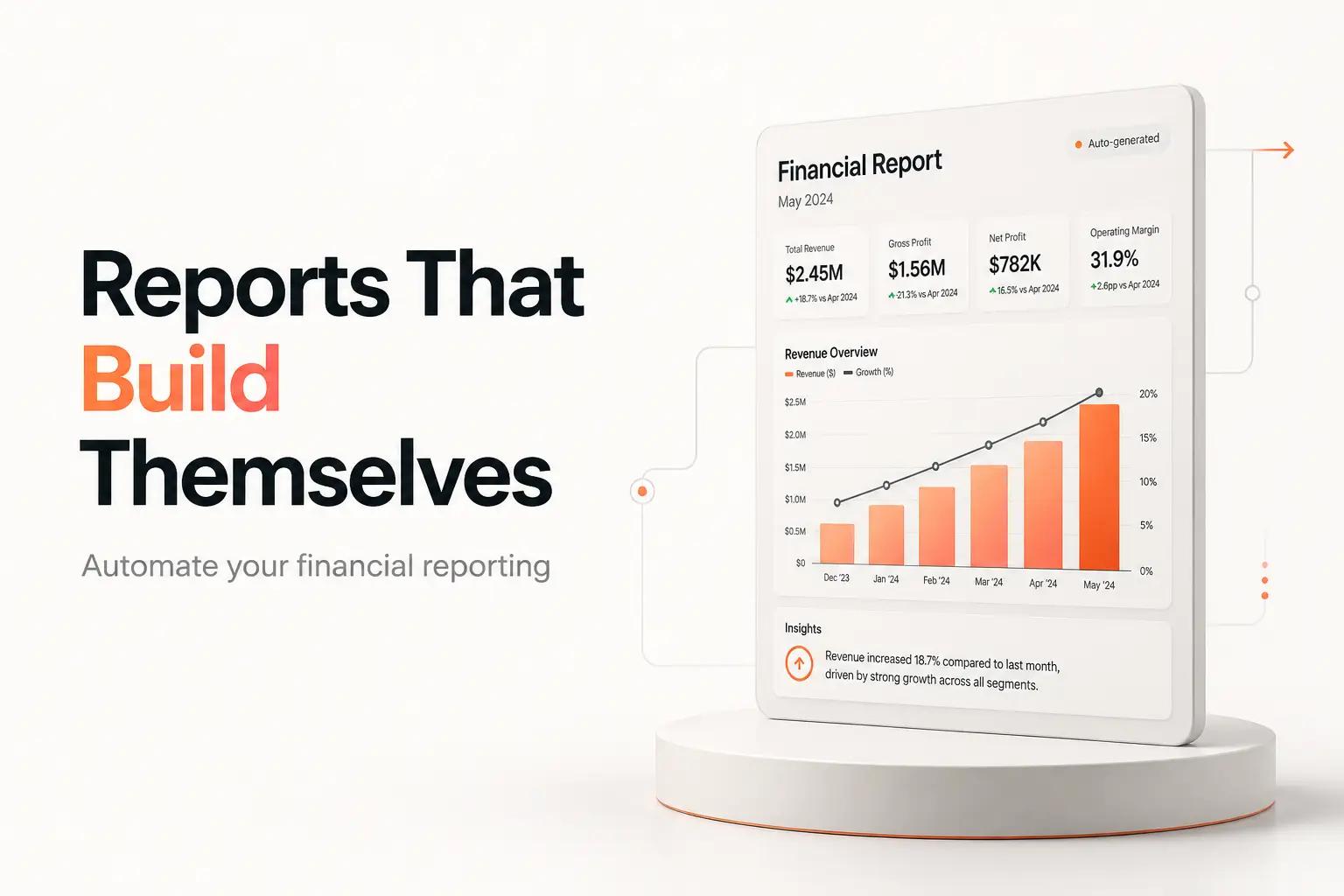
A reporting pipeline we build looks like this. On a schedule, pull the raw numbers from every source through its API (the CRM, Stripe, the ad platforms, the warehouse, the spreadsheet of manual adjustments). Compute each metric once, with a definition your team agreed on. Then deliver the result where people read it: a formatted Slack post at 8am, a weekly email with the four board numbers, a refreshed dashboard, or a PDF for the deck. Add a threshold alert so a broken sync or a bad number pings you instead of shipping silently.
That spans three of our services. Integrations to get data out of each tool through its API instead of a manual export. Custom Builds for the job that computes and formats the report. AI Automation where a number needs a written summary or an anomaly needs explaining in plain language. If the CSV re-keying is really the bottleneck, that is its own fixable job, covered in our guide to automating data entry.
Two ways to work with us. A $4K project fits a defined reporting build: a fixed set of sources, one or two recurring reports, integrations included, with 30 days of post-launch support. The $3K/month retainer fits a team whose reporting keeps growing, up to 3 active workflows at a time, with ongoing monitoring and fixes when a source changes its API or a metric definition shifts. No free tier and no self-serve button, because the value is in the build, not a login.
Best for: a team that already knows the Monday report by heart because they build it by hand, and wants it to build and send itself.
2. The visualization layer: Looker Studio, Power BI, Tableau, Metabase
These are the dashboard and BI tools. They draw the charts and, if your data already lives in one clean place, they refresh on a schedule. They are the display half of automated reporting, and several are genuinely good at it.
- Looker Studio is free, per Google Cloud's pricing. It connects cleanly to Google's own stack (Analytics, Ads, BigQuery, Sheets) and is the default starting point for anyone already in that ecosystem. Looker Studio Pro adds team management and support as a paid add-on through Google Cloud.
- Power BI runs $14/user/month for Pro and $24/user/month for Premium Per User, both billed yearly, per Microsoft's pricing page. The natural pick for a Microsoft 365 shop.
- Tableau lists $75/user/month for Creator, $42 for Explorer, and $15 for Viewer, billed annually on Tableau Cloud. Powerful and expensive, aimed at teams that will invest in real analysts.
- Metabase is $100/month for Starter (first 5 users included, then $6/user) and $575/month for Pro (first 10 users, then $12/user), per Metabase's pricing. It sits on top of a database you own, so it fits teams whose data already lands in one SQL warehouse.
The honest limit: every one of these is at its best when the data is already blended and sitting in one source it connects to. Point it at a clean warehouse and it shines. Ask it to reach into six separate SaaS tools, reconcile them, and post a summary to Slack, and you are back to a person doing the reaching. The dashboard is the easy 20%.
Best for: the display layer, once the data pipeline feeding it exists.
3. Databox (connector-based dashboards)
Databox leans the other way. Instead of assuming a warehouse, it ships pre-built connectors to marketing and sales tools and stitches metrics into dashboards and scheduled reports without SQL.
Pricing, per Databox's pricing page: a Free plan ($0, 3 data sources, 1 user), Analyst at $64/month (5 sources, 1 user), Pro at $159/month (unlimited users, 3 sources plus $5.60/month per extra), and Growth at $399/month, all billed annually. Unlimited users on the paid team plans is the standout, since it means you are billed by data sources and features, not seats.
It genuinely automates scheduled marketing reports. Where it runs out is the custom metric that lives in a tool it does not have a connector for, or a definition that needs real logic. Then you are back to a manual feed or a workaround.
Best for: an agency or marketing team assembling recurring dashboards from common ad and analytics sources.
4. DIY glue: Zapier, Make, n8n
If the missing piece is only the schedule and the delivery, a general automation tool can pull a few numbers on a timer and post them to Slack or email. This is the lightweight version of what we build, hand-assembled. It works for a two or three number report. It gets brittle fast when the logic branches, the sources multiply, or a metric needs reconciling, which is the moment most teams call us. We cover the trade-offs of these platforms in no-code automation tools.
Best for: a genuinely simple recurring push that one person is willing to own and babysit.
Pricing at a glance
| Tool | Entry price | Billing unit | Best fit |
|---|---|---|---|
| bottta | $4K project / $3K per month | Fixed scope / retainer | The full pull-compute-deliver pipeline, built and monitored |
| Looker Studio | $0 | Free (Pro is a paid add-on) | Google-stack dashboards |
| Power BI | $14/user/mo (Pro) | Per user, yearly | Microsoft 365 shops |
| Tableau | $15/user/mo (Viewer) | Per user, yearly | Analyst-heavy teams |
| Metabase | $100/mo (Starter, 5 users) | Per plan + per user | Teams with a SQL warehouse |
| Databox | $64/mo (Analyst) | Per plan + data sources | Marketing/agency dashboards |
Prices are each vendor's published rates as of September 2026. Verify against the pricing pages before you buy, since tiers move.
How to choose
Match the tool to where your reporting actually breaks, not to the longest feature list.
- If your data already lives in one warehouse and you just need charts, pick a BI tool and move on. Looker Studio if you are in Google's stack, Power BI if Microsoft, Metabase if you own a SQL database. The pipeline is not your problem.
- If your report spans a handful of common marketing tools, Databox's connectors will save you a build, as long as every source you need is on its list.
- If the report is two or three numbers pushed to Slack, wire it in a no-code tool and own it yourself.
- If the metric crosses tools none of them cleanly blend, the definition needs real logic, or the report has to arrive formatted and reliable every week, that is a pipeline, not a dashboard. That is where working with bottta beats stacking another tool on the pile. Deciding whether a given report is even worth automating is its own call, worked through in when to automate and when not to.
The broader point holds across your whole ops stack, not just reporting: the tool that displays the work is rarely the tool that does it. For the wider category, see our rundown of workflow automation tools.
Frequently asked questions
What is an automated reporting tool? Any tool that pulls data from your systems, turns it into a report, and refreshes or delivers it without a person assembling it by hand each time. In practice the category splits into dashboard/BI tools that draw the charts (Looker Studio, Power BI, Tableau, Metabase), connector-based dashboards (Databox), and the automation layer that pulls data in and pushes the finished report out.
Can I automate reporting for free? Partly. Looker Studio is free and will build and schedule a dashboard from Google-stack data at no cost. The catch is that "free" ends the moment your numbers live in tools it does not connect to, because then a person is doing the exporting and blending, and that labor is the real cost.
What is the difference between a dashboard and an automated report? A dashboard is pull: it waits at a URL for someone to open it. An automated report is push: it arrives where the reader already is, on a schedule, without anyone building it. A tool can automate the dashboard and still leave the report manual, which is the gap most roundups miss.
Do I need a data warehouse to automate reporting? Not necessarily. If your metrics live in a few common SaaS tools, connector-based tools or a custom pipeline can blend them directly. A warehouse helps once you have many sources and want one clean place for every BI tool to read from, but a lean team can automate its core reports well before it needs one.
Why not just use Zapier to build reports? For a two or three number push to Slack, that works. It gets brittle when the logic branches, sources multiply, or a metric needs reconciling across tools, because a general automation tool is not built to compute and format a real report. That is the point where a purpose-built pipeline is worth it.
A dashboard is where a number goes to be looked for. A report is a number that comes to you. The one you rebuild by hand every Monday is a pipeline waiting to exist, and building it is exactly the work we take on. See what that looks like for your Monday report at bottta.com.